
Recipe Template for Pages: Design Your 2026 Cookbook
You've probably got the same problem most first-time cookbook authors have. The recipes are good, but the files are not. Half are in Notes, some are in Word, a few are in email drafts, and the “master document” is a long scroll of ingredients, photos, and random formatting that falls apart the moment you try to make it look like an actual book.
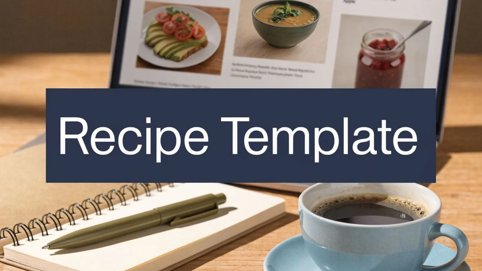
That's where Apple Pages surprises people.
Most writers think of Pages as a light word processor. In practice, it can handle a polished recipe template for pages workflow if you approach it like a book designer instead of like someone typing into a blank page. The difference isn't talent. It's structure, typography, image handling, and export discipline.
Recipe formatting has a long history. Fannie Merritt Farmer's The Boston Cooking-School Cook Book (1896) is known for popularizing level measurements and standardized measuring spoons and cups (University of Washington Information School, read November 20, 2026). Good recipe design has always depended on consistency. Readers don't want to decode your layout while they're cooking.
From Kitchen Notes to Cookbook Ready
A professional cookbook doesn't start with decoration. It starts when every recipe follows the same logic.
That means the title lands in the same place every time. The ingredient list uses the same spacing every time. Prep notes, yields, and method steps appear in a familiar order. Readers feel that consistency immediately, even if they can't name it. Without it, a manuscript feels homemade in the wrong way.
Pages is a good fit for authors who want more control than a basic document but don't want to commit to a heavy design program. It's especially useful when your cookbook needs to look polished without becoming a full technical production project. You can build reusable styles, place images precisely, create section-based layouts, and export files for both print and digital use.
The authors who get the best results in Pages usually stop thinking in terms of “pages” and start thinking in terms of template behavior. Each recipe should flow through a repeatable pattern. If your mushroom soup page looks radically different from your roast chicken page, the problem usually isn't the recipe. It's the template.
A cookbook interior needs four things:
- One repeatable recipe model that works for short and long recipes
- Predictable hierarchy so title, ingredients, and method never compete
- Consistent image treatment so photos support the text instead of overpowering it
- Export-ready formatting from the beginning, not as a last-minute fix
That's what turns scattered kitchen notes into a book file a printer and an eBook platform can accept.
Laying the Foundation: Your Document Setup
A common first-time mistake looks harmless at the start. An author opens Pages, drops in a few recipe cards, adds photos as they go, then decides six weeks later to turn the file into a print-on-demand cookbook and an eBook. That is usually when the rebuild starts.
Pages can handle a polished cookbook interior, but only if the file is set up like a book from page one. Recipe cards for screen reading are forgiving. Print files are not. eBook retailers are different again. If you want one project to serve both, your setup choices have to support export, image handling, and consistent page behavior long before the design looks finished.
Start with a book file, not a decorative template
Open a blank document. Flyer, brochure, and invitation templates carry built-in styling choices that fight you later. In a cookbook, hidden defaults become cleanup work.
Set the structure before you place a single recipe:
Choose the final trim size first
Pick the exact printed size your book will use, then stay with it. A 7 x 10 cookbook behaves differently from an 8.5 x 11 book. Line length changes. Photo scale changes. So does the amount of room available for notes, nutrition panels, and headnotes.Set margins for binding, not just for screen balance
Start with 1-inch margins as a working baseline, then adjust with the binding method and trim size in mind. A cookbook that will be perfect bound needs enough inner space that method steps and ingredient quantities do not sink toward the gutter.Turn on facing pages
Cooks experience a printed book as spreads, not isolated single pages. Facing pages lets you judge balance across left and right pages, control where photos land, and avoid recipes that feel crowded near the spine. Apple describes facing pages as the setting for book layouts, with different margins to accommodate binding (Pages User Guide, read November 20, 2026).Decide early whether the file is print-led or digital-led
Build for print first, then create the eBook export from that disciplined structure. Print has stricter physical limits. If the layout survives print requirements, it is much easier to simplify for digital than to retrofit a loose digital file for press.
The setup choices that save rework later
Trim size is not an abstract preference. It affects every recipe that follows.
Change the trim after 40 or 80 pages and you will reflow ingredients, recrop photos, and reset page breaks. In Pages, that kind of rework is manageable on a short project and painful on a full cookbook. Professional book production starts by locking the page geometry early.
Color handling matters too. Pages is not a full prepress application, so authors need to be realistic about what it can and cannot control. If your printer requires CMYK-ready files or specific PDF export standards, check those specifications before layout begins. Print-on-demand platforms reject interiors and covers that do not meet their file requirements. The same applies to bleed. If your photos or color blocks run to the page edge, bleed is required because trim is never mathematically perfect in production. For interior images that run off the page, Amazon KDP extends the page 0.125 in past the trim on the top, bottom and outer edges, not the gutter side (KDP paperback submission guidelines, read November 20, 2026).
A setup checklist before building the first recipe page
| Setting | What to choose | Why it matters |
|---|---|---|
| Document type | Blank Pages document | Avoids inherited styling you will spend hours removing |
| Trim size | Final print size | Keeps text flow, image scale, and page count stable |
| Margins | Start at 1 inch | Protects readability and gives the binding edge enough room |
| Facing pages | Enabled | Shows real spread behavior instead of isolated pages |
| Headers and footers | Minimal | Leaves room for the recipe itself |
| Image prep | Print-ready files sized for use | Reduces soft images and awkward scaling |
| Export planning | Printer and eBook specs checked early | Prevents late-stage file rejection |
A strong type system will matter later, and professional book font choices for cookbook interiors should be considered early, but font pairing is not the first setup decision. Page size, margins, and production requirements come first because they determine how much typographic space you have to work with.
What to avoid at the document stage
Several habits create avoidable problems in Pages:
- Building every page from scratch instead of creating a repeatable base layout
- Using oversized images and shrinking them visually without tracking the effective print quality
- Letting text boxes float freely with no alignment logic
- Adding full-bleed artwork before confirming bleed requirements
- Assuming the same PDF will satisfy both print-on-demand and global eBook distribution
That last point catches many first-time authors. Kindle, Apple Books, and print-on-demand vendors do not evaluate files the same way. A Pages document can support both paths, but only if the foundation is disciplined enough to export cleanly for each use.
Mastering Typography for Readability and Style
A recipe page succeeds or fails in the seconds between a reader glancing down and starting the first step. In a home kitchen, that means flour on the counter, uneven light, and quick back-and-forth scanning. In print-on-demand and eBook distribution, it also means your typography has to survive different trim sizes, screen rendering, and export quirks inside Pages.
Build hierarchy with paragraph styles
Pages gives first-time cookbook authors enough control to produce a respectable interior, but only if the type system is disciplined. Paragraph Styles do that job (Pages User Guide, read November 20, 2026). They keep recipe titles, headnotes, ingredients, and method steps consistent across the whole manuscript, which matters once the book grows past a handful of pages.
Set the hierarchy before you polish anything else:
- Recipe title in a bold display face at 24pt
- Ingredients in a readable body style at 12pt
- Method steps in a numbered 12pt style
- Headnotes or serving notes in a smaller complementary style
These sizes are a starting point. The point is not decoration. The point is instant recognition. A reader should know what each block is doing before reading a full line.
For authors still choosing typefaces, see popular book fonts.
Choose fonts that hold up in use
Cookbook typography has a practical job. It must stay readable on cream paper, under kitchen lighting, and in print-on-demand output that may not reproduce delicate letterforms gracefully. The same content may also end up in a fixed-layout or reflowable eBook, where overly fussy styling starts to break down.
A strong pairing usually includes one display face and one workhorse body face. Use the display font for titles or section markers. Keep ingredients and method text in a stable, book-friendly font with clear numerals, open counters, and reliable italics.
That trade-off matters. A font with personality can give the book a point of view. A font that is too decorative slows reading, weakens scannability, and often looks worse after export from Pages to PDF or EPUB.
What works on cookbook pages
Authors often assume typography is about taste. In production, it is mostly about control.
What works
- Clear contrast between title, ingredients, and method
- Consistent line spacing that keeps lists from collapsing into a gray block
- Stable numbering and bullets generated by styles, not typed by hand
- Enough white space for the eye to reset between dense instructions
What doesn't
- Script fonts for ingredients
- Tiny captions tucked under photos
- Font changes that shift from chapter to chapter without a system
- Tight leading that makes fractions, abbreviations, and step numbers blur together
The same judgment applies to supporting notes and sidebars. A short substitution tip can use a secondary style. It should still feel part of the same book.
A simple style map for your template
Create these named styles in Pages before you place the full manuscript. That one decision will save hours of cleanup later, especially if you need one export for print and another for eBook distribution.
| Style name | Use | Design note |
|---|---|---|
| Recipe Title | Recipe name | Largest type on page |
| Intro Note | Short description | Slightly smaller, softer tone |
| Ingredient List | Ingredients | Keep line spacing steady |
| Method Step | Directions | Use numbering, not manual typing |
| Recipe Note | Tips, swaps, storage | Distinct but secondary |
This is how professionals keep a cookbook editable. If chapter openers need a different title size, change the style once. If ingredient lists feel cramped in proof, adjust the leading once. Inside Pages, that is the difference between a digital recipe card and a cookbook file that can survive real production.
Designing Your Layout with Grids and Images
A recipe page usually breaks down at the moment an author starts dragging boxes around by eye.
On screen, the page can look tidy enough. In production, those small inconsistencies show up fast. Ingredient blocks drift. Photos sit too close to the gutter. A continuation page looks like it belongs to another book. Apple Pages can handle a professional cookbook layout, but only if the page is built on rules instead of guesswork.
Use a grid even if the reader never notices it
Readers should not have to search the page. The title, headnote, ingredients, method, and image need fixed relationships from one recipe to the next.
In Pages, that means setting repeatable alignment points and sticking to them. Keep the title and headnote in one zone. Give the ingredient list its own block. Reserve a dependable area for the method. Set an image frame size before you start placing photos. Authors who do this early get a file that can survive print-on-demand formatting and still adapt for eBook exports later.
Divide recipe pages into five working zones:
- title and short headnote
- ingredients
- method
- image area
- notes, substitutions, or storage tips
That structure gives short and long recipes the same visual logic.
Tables are better than tabs for ingredient lists
Pages will let you fake alignment with spaces and tabs. That approach rarely holds up across a full manuscript.
A borderless table is the cleaner tool. Use columns for quantity, ingredient, and note, or combine quantity and ingredient if the design needs less width. The benefit is stability. If one recipe includes grouped components, parenthetical prep notes, or lines like "divided" and "room temperature," the table keeps the list aligned without manual repairs on every page.
That is the difference between a simple digital recipe card and a cookbook interior that behaves like a production file. For broader principles behind that kind of structure, see book layout design.
Treat images as print assets
Food photography carries the page, but it cannot bully the text.
Set image sizes with intention. A full-width hero photo can work for a signature recipe, but repeating that treatment for every spread makes the book feel flat. Smaller process shots, ingredient close-ups, and plated details often create better rhythm. A strong cookbook page controls contrast between image-heavy recipes and text-led recipes so the reader does not feel visually fatigued halfway through the chapter.
Use placeholders while the manuscript is still in development. Fixed image boxes help you solve pacing, white space, and crop proportions before the final photography arrives. That matters in Pages because authors often build the page with temporary low-resolution files, then discover too late that the final images crop differently.
For print, image quality and page edges need special care. Use high-resolution source files that hold up at print size. If a photo runs to the edge of the page, extend it past the trim line to cover bleed. Without that extra image area, minor trimming shifts can leave a white sliver on the edge of the page. That problem looks amateur immediately.
A good food image should read clearly at thumbnail size, at full page, and after trimming. The same discipline helps with digital exports, especially when the book also needs to work across international eBook storefronts that may compress or resize images.
Handling long recipes without damaging the spread
Long recipes need rules before they need styling.
Keep the ingredient list together whenever possible. Cooks refer back to it constantly, and splitting it across pages creates friction at the stove. If the recipe must continue, move notes or variations to the second page first. Repeat the recipe title, or use a short running label, so the continuation feels planned rather than accidental.
Watch the page bottom closely. A stranded step number or one short instruction line at the foot of the page looks careless. Reflow the text so the break lands after a complete action.
Pages can still produce a professional result, provided you build the template for variable recipe length from the start. That is the gap many free tutorials ignore. They show how to make one attractive page. A cookbook needs 80, 120, or 200 pages that stay orderly in print and remain adaptable for global digital distribution.
Finalizing for Print and Global Distribution
You finish the layout at midnight, export the file from Pages, upload it to a print-on-demand platform, and expect the hard part to be over. Then the proof comes back with images sitting too close to trim, color shifts in the food photography, or an EPUB that behaves badly on smaller screens. That is the stage where a promising cookbook starts looking amateur.
Apple Pages can take a cookbook surprisingly far. It can also hide production problems until export. Free tutorials usually stop at the point where the page looks attractive on a Mac. Real publishing work starts when that file has to survive printing, retailer checks, and digital reading systems in more than one market.
Print and digital need separate outputs
A cookbook for print and a cookbook for eBook are related products, but they are not the same deliverable.
For print, the job is a press-ready PDF with stable margins, correctly prepared images, and bleed wherever artwork runs to the edge. For digital, the job is a file that reads in the right order, adapts to different screens, and remains usable for readers who change font size or rely on accessibility features. Pages can export both, but the settings and review process should change with the format. Pages exports EPUB as a fixed or a reflowable layout, and page layout documents can use only a fixed layout (Pages User Guide, read November 20, 2026).
Authors who try to force one export to cover every use case usually create extra repair work later.
Print production rewards precision
Print-on-demand systems are unforgiving. Small setup errors that look harmless on screen often show up immediately in proof copies.
Check these items before exporting the PDF:
- Margins are consistent across every recipe page
- Full-bleed images extend past the trim line
- Headers, folios, and page furniture sit safely inside the live area
- Photos are sharp enough for print at final size
- The exported PDF has been reviewed page by page, not just skimmed in Pages
Bleed and color preparation are required if you want a professional result. Pages is not a full prepress application, so you need to compensate with careful proofing. In cookbook work, reds, greens, and warm baked tones are often the first colors to disappoint in print. A screen makes them look luminous. Ink puts them under stricter conditions.
Proof the PDF like a production editor, not like the writer who is relieved to be done. That is where you catch muddy shadows in a roast chicken photo, a pale cream background that disappears on paper, or a caption drifting too close to the trim.
Global eBook distribution adds another layer
An EPUB that looks fine on your own tablet can still fail retailer checks or create accessibility problems for readers. Apple Books, Kobo, and other retailers all expect clean structure, and European distribution carries stronger accessibility pressure under the European Accessibility Act, which covers e-books and e-readers sold to consumers and applies from June 28, 2025 (EUR-Lex, read November 20, 2026).
For a cookbook, that usually means the digital edition should prioritize:
- A logical reading order
- Real paragraph and heading styles, not manual formatting
- Alt text for meaningful instructional images
- Readable body text that reflows on phones and tablets
- Clear links, labels, and navigation inside the EPUB
Fixed-layout EPUBs still have a place, especially for highly designed books where image placement is part of the teaching. They also create more distribution risk. Some platforms support them poorly, some readers disable useful accessibility controls, and validation can become more difficult if the Pages file was built with inconsistent spacing or objects floating unpredictably.
If you are planning a full release, see formatting for KDP, Apple Books and IngramSpark for what each retailer expects.
Recipe Template FAQs and Expert Tips
Carefully, and in stages.
A common but often ignored problem is converting legacy Word documents. Pages opens and edits .doc and .docx files (Pages User Guide, read November 20, 2026), but complex layouts can shift on import. In practice, the usual failures are misaligned tables, shifted tabs, broken image anchors, and strange paragraph spacing.
The safest method is not to “fix” the imported Word design. Import the text, then rebuild the structure in your Pages template. Preserve content. Recreate layout.
For planning, reviewing, and light edits, iPad is fine. For actual layout production, Mac is better.
The reason isn't prestige. It's control. Long documents, image placement, style management, table behavior, and export review all go faster when you have the full desktop interface. If you're serious about print, use the iPad as a companion device, not the primary production station.
Use fixed layout only when the design itself must remain locked and the platform fully supports that experience. Use reflowable EPUB when readability, accessibility, and device flexibility matter more. In Pages, a page layout document can export only a fixed layout, so a reflowable EPUB starts from a word processing document.
For most cookbook authors, that means the print edition carries the fully designed page architecture, while the digital edition needs a cleaner reading experience with text that adapts well to different screens.
It's rarely one dramatic mistake. It's usually a stack of small ones:
- Too many font styles competing on one page
- Ingredient lists aligned with tabs and spaces instead of a controlled structure
- Photos placed without regard for trim or reading flow
- Inconsistent spacing between one recipe and the next
Think like a systems designer, not a decorator.
If the template works, each new recipe becomes easier to place, easier to proof, and easier to export. If the template depends on hand-tuning every page, the manuscript will fight you all the way to publication.
Ready to publish your cookbook?
Talk to a real publisher first. You leave the call with your exact price for your book.
More on getting your book taken seriously.
Picture book format: a complete 2026 guide
The 32-page rule, trim size, bleed, gutter, image resolution, type and fixed-layout ebooks for a picture book.
Formatting an illustrated or complex book
Why images and tables break reflowable ebooks, when fixed layout is the right answer, and what complex work costs.
Formatting for KDP, Apple Books, and IngramSpark
What each retailer validates, which is strictest, and why a file one store accepts another rejects.