
Picture Book Format: A Complete 2026 Guide
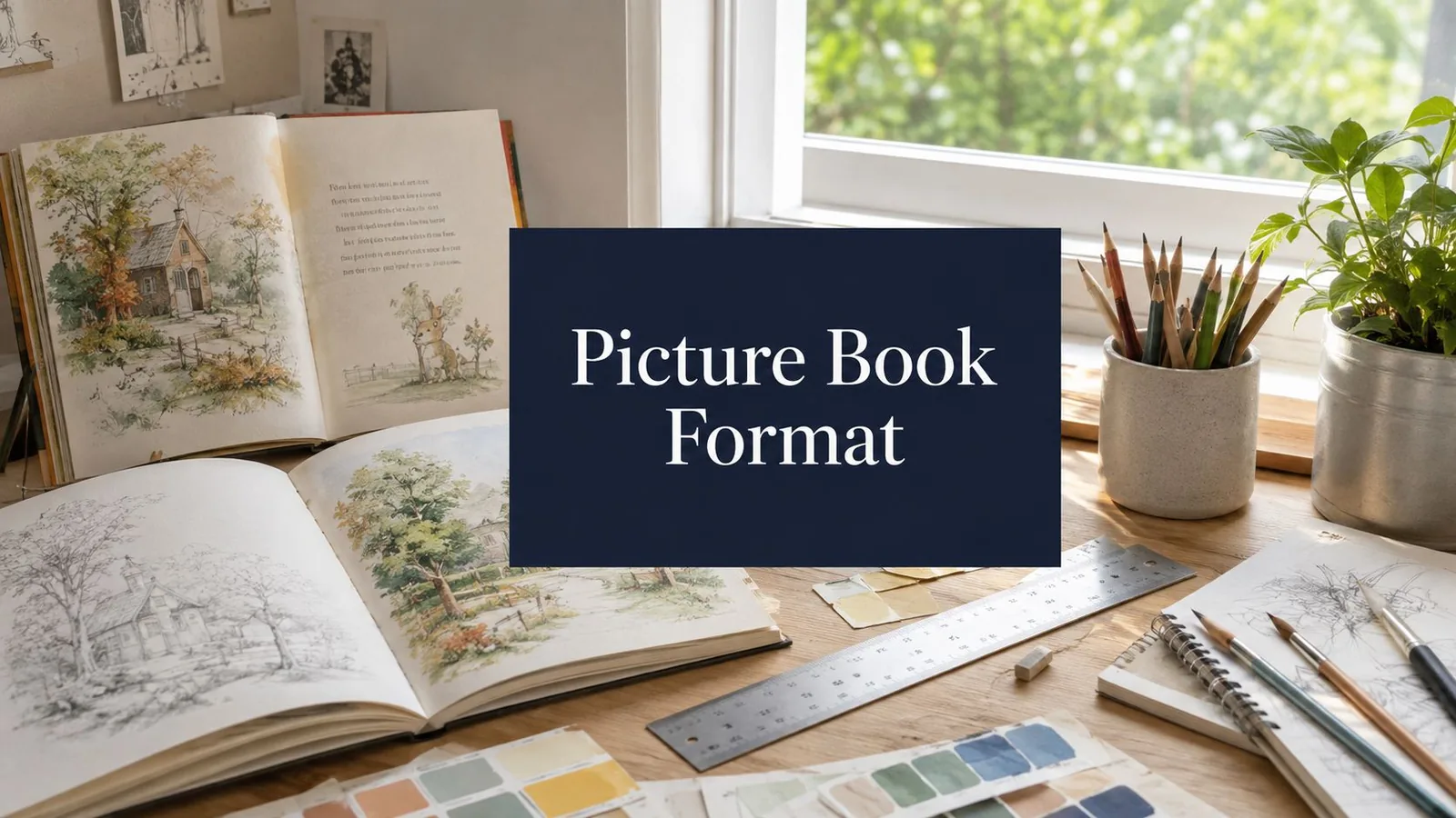
You've got a finished picture book manuscript, a clean PDF of the text, and the uneasy feeling that the hard part is still ahead. That feeling is usually right. The moment a story leaves the page and becomes a picture book format project, every decision starts affecting trim, page count, spreads, bleed, and whether the printer will accept the file without a return trip that costs time and sanity.
Starting From a Finished Manuscript
A polished manuscript isn't a layout file yet. It's just the point where production starts making the choices that will shape how the story lands in print. The first trap is assuming the story can be dropped into a 32-page shell after the fact. In practice, the page budget gets spent before any art is placed, because front matter and back matter take space that first-time authors often mentally reserve for story.
The format settled around 32 pages as a conventional length: a picture book is typically 32 pages, or two signatures (Debbie Ohi, Picture Books 101, read November 20, 2026). Publishers Weekly's history of the picture book traces the form from Orbis Sensualium Pictus in 1658 to the first Randolph Caldecott Medal in 1938 (read November 20, 2026).
Lock the page budget before you touch artwork
A working picture book layout starts with a simple question: how many pages are left after the title page, copyright page, dedication, and any end sheets? A manuscript that reads beautifully in Word can still fail once it is mapped to spreads. Debbie Ohi's guide recommends thinking in double-page spreads, since young readers look at a full spread at a time (Debbie Ohi, Picture Books 101, read November 20, 2026).
That's why editing and format planning belong in the same conversation. A story may need line cuts, beat shifts, or a cleaner ending before any illustrator touches it.
Choosing a Trim Size and Page Count
Trim size decides how the art breathes, how much room the text has, and how much pain you'll feel later if the composition is wrong. A square book feels stable and friendly, a wider rectangle gives spreads more horizontal motion, and oversized formats can make illustration the dominant engine of the page. That choice isn't cosmetic. It changes how the book sits on press sheets, how the gutter behaves, and how expensive it is to print cleanly.
The 32-page book is still the familiar baseline, but the core production question is whether the story needs that exact container or a different one.
Use the trim size as a storytelling constraint
The most practical decision matrix is this. If the story is intimate and text-light, a square or near-square format usually stays manageable. If the art needs long horizon lines, motion, or visual reveal across the gutter, a wider format earns its keep. If the text is being squeezed just to hit a fashionable shape, the trim choice is probably wrong.
For authors preparing a dummy, the standard book sizes guide compares the common dimensions against the story you have.
Don't ignore page count math
Books are produced in page counts that are multiples of eight, and a 32-page picture book is two signatures. Adding pages usually means adding a signature, which gives 40 or 48 pages (Debbie Ohi, Picture Books 101, read November 20, 2026). Plan the story to its page count from the start.
A book that wants 40 pages should be treated as a 40-page book from the start. Forcing a 40-page story into a 32-page plan usually creates the most expensive kind of rewrite, the one that happens after layout.
Bleed, Gutter, Margins, and the Safe Zone
Once the trim is chosen, the page stops being a concept and becomes a physical object with edges that get cut, folded, and swallowed by binding. Beautiful files fail here. Art built to the trim line instead of past it can come back with a white sliver along the outer edge, and a face placed too close to the gutter can disappear into the spine.
Treat bleed as a production requirement, not decoration
KDP trims 0.125 inches from the top, bottom and outside edges, so art that reaches those edges needs 0.125 inches of bleed, and a minimum of 300 DPI for all images (KDP, Paperback submission guidelines, read November 20, 2026). The canvas has to extend beyond the final trim size so the printer can cut into the art safely.
The gutter is the danger zone created by binding. A face, a logo, or a line of text that looks centered in the file can drift inward once the book is glued or sewn. The fix is simple in theory and unforgiving in practice, keep critical content inside the safe zone and never assume the spine will behave like a flat page.
Build the file like the printer will cut it
A clean prepress pass usually follows the same order.
- Check the trim first: confirm the final page size before placing any artwork.
- Extend full-bleed art past the edge: don't stop at the trim line.
- Keep text off the danger areas: leave faces, page numbers, and captions well inside the margin.
- Inspect every spread separately: a single bad spread can send the whole file back.
- Preview the gutter: if a key detail straddles the spine, move it.
The common failure modes are boring and expensive: white edges, clipped text, and art that looks fine on screen but fails after trimming. Fixed-layout interiors need the same discipline, because what the file shows and what the press cuts are not the same thing.
If you're checking your own file, do it before export, not after the printer sends a proof. That's the difference between a correction and a reprint.
Image Resolution and Color Profiles
Resolution problems are silent until they aren't. A picture book can look crisp on a laptop and still print soft, jagged, or muddy if the original files were exported too small or in the wrong color mode. This is one of the most common places where first-time authors trust the screen and get burned by the press.
Start with the file, not the preview
For print interiors, 300 DPI is the minimum KDP accepts for images (KDP, Paperback submission guidelines, read November 20, 2026). Web images built for screens are often too small, and once they're enlarged in layout, the softness becomes obvious in the final book. JPEG compression can also leave artifacts around line work, which is especially ugly in illustrations that depend on clean edges.
Color is the other hidden trap. Screens display in RGB, but print needs a color-managed workflow that gets the file into a print-safe state before export. That is why the on-screen blue you loved does not always survive press output intact.
Run a simple preflight on every illustration
Before export, verify these four things on every interior image.
| Picture Book Production Specs at a Glance | Standard | Why It Matters |
|---|---|---|
| Image resolution | 300 DPI minimum | Prevents soft or blurry print output |
| Color mode | Print-managed, not screen-only RGB | Reduces unexpected color shifts |
| Full-bleed art | Extends past trim | Prevents white slivers at the cut line |
| File export | Fixed-layout PDF for print interiors | Keeps the page design stable |
A useful habit is to inspect the source file at actual size, then look at the exported PDF, then print a proof if the book is image-heavy. If color only looks good on one monitor, that's a warning, not a reassurance.
The screen is a preview, and the printer decides.
If the only available illustration file is low resolution, don't upscale it and hope. Rebuild it, re-export it, or replace it. The press has no sympathy for wishful thinking.
Typography and Accessibility
Typography in a picture book isn't about branding first. It's about whether a child can track the words and whether the adult reading aloud can do it without stumbling. The wrong font makes even a good manuscript feel fussy. The right font disappears into the experience, which is exactly what it should do.
Choose type that survives read-aloud distance
For body text, clean sans-serif or very readable serif faces usually outperform decorative scripts. Script fonts and novelty display faces might work for a title, but they tend to collapse in running text, especially when the book is being read from a lap at a slight angle.Give body text enough size and leading that the lines do not crowd each other.
That spacing matters more than most authors expect. A picture book page already has visual competition from the art, so text needs room to breathe. If the words sit on a busy illustration, add a solid backing shape or move the copy to a quieter area of the spread.
Design for children and adults at the same time
Accessibility isn't a separate layer here. It's part of legibility. High contrast between text and background is the baseline. Avoid long passages in all caps, because they slow scanning and tire the eye. Generous letter spacing can help, but only when it doesn't make the line look broken or detached from the page.
A useful test is to read the spread aloud from arm's length and then from lap distance. If your eye keeps slipping off the line, a young reader will struggle more. Typography that works for a polished mockup but fails in the reading position is the wrong typography.
The title can carry personality. The body text has a job to do. Keep those jobs separate.
Fixed-Layout eBook Setup and Export
A printed picture book and a digital picture book are cousins, not twins. The print file is built for trim, bleed, and binding. The digital file has to preserve spreads on different screens without falling apart when a retailer reprocesses it. That's why the same artwork often needs two masters, one for print, one for fixed-layout export.
Reflowable EPUB is usually the wrong tool
Picture books depend on controlled page turns, fixed art placement, and text that sits in relation to the illustration. Reflowable EPUB lets the reader resize content and rearrange the page, which works for novels and many nonfiction books, but it can wreck a picture book's pacing. Fixed-layout EPUB is the closer match because it preserves the designed spread and keeps the illustration-text relationship intact.
The practical issue is platform handling. Amazon Kindle, Apple Books, Barnes & Noble, and Google Books all accept digital submissions in different ways, and each one expects clean fixed-layout packaging rather than a generic dump of print pages. The formatting for KDP, Apple Books and IngramSpark guide covers each platform. That's why you need to test the file on more than one screen, because a spread that behaves on a tablet can break on a phone.
Export with the device in mind
For digital, the key checks are simpler than print but more unforgiving in a different way.
- Embed fonts: if the platform can't see the font, the text may substitute badly.
- Check spread behavior: verify that facing pages stay aligned where intended.
- Test small screens: a layout that looks balanced on a tablet may feel cramped on a phone.
- Keep artwork clean: the same illustration may need a separate export treatment from the print master.
- Upload the right file type: don't assume the print PDF belongs in the eBook pipeline.
The point is not to make the digital version identical to print. It's to keep the story readable and the art stable across devices. For other illustrated books, see formatting an illustrated or complex book.
Final Submission Checklist and Common Pitfalls
Before anything goes to a printer or platform, run a final preflight like a production manager who's already been burned once. That means checking the file in the same order the printer or retailer is likely to judge it. Once the file leaves your hands, small mistakes become expensive fast.
Verify the whole book, not just the prettiest spread
The checklist is straightforward.
- Page count locked: the interior matches the planned picture book structure.
- Safe zone respected: no critical text or faces live too near the edge or gutter.
- Bleed applied: any full-bleed spread extends 0.125 inches beyond trim.
- Fonts embedded: the file won't trigger substitution on upload.
- Images at spec: interior art holds the required 300 DPI standard.
- Export matches destination: print PDF for print, fixed-layout file for eBook.
The biggest rejection triggers are predictable. KDP says that if even one page in the interior needs bleed, the whole file should be set up with bleed (KDP, Set trim size, bleed, and margins, read November 20, 2026). A page count mismatch can break the imposed signature plan. Missing font embedding can distort the eBook. Last-minute text edits are especially dangerous because they shift line breaks and can ruin a carefully balanced spread.
Good picture book formatting doesn't feel clever when it's done right. It feels invisible. The file prints cleanly, the pages turn where they should, and the art and text do their jobs without fighting each other.
Ready to publish your picture book?
Talk to a real publisher first. You leave the call with your exact price for your book.
More on getting your book taken seriously.
Recipe template for Pages: design your 2026 cookbook
Set up a cookbook in Apple Pages: trim and margins, styles, grids, images, and the print and eBook exports.
Formatting an illustrated or complex book
Why images and tables break reflowable ebooks, when fixed layout is the right answer, and what complex work costs.
Formatting for KDP, Apple Books, and IngramSpark
What each retailer validates, which is strictest, and why a file one store accepts another rejects.