
One concept is a verdict. Ten is a fog.
The number of cover concepts you are offered says more about the process than the price does. Here is what the right number is, and how to choose between them without designing by committee.
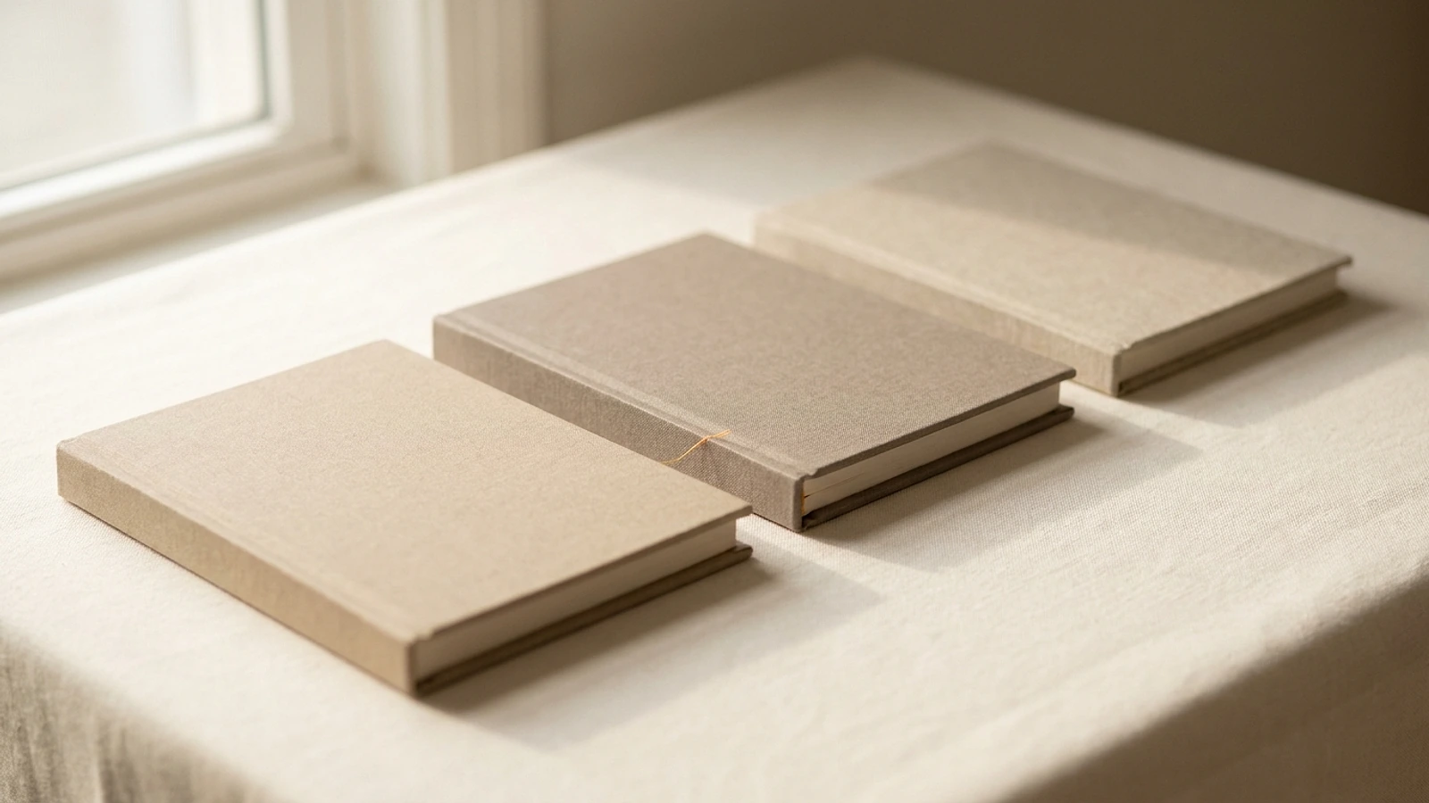
Cover packages advertise anywhere from one concept to unlimited revisions, and the number is treated as a measure of value. It is not. It is a description of the process, and both extremes describe processes that produce worse covers.
Here is why the number matters, what makes concepts genuinely different rather than nominally different, and how to choose between them without turning the decision into a committee.
Why one concept is too few
A single concept forces a verdict rather than a decision. You either accept it or you reject it, and rejecting it means starting again with nothing learned except that you did not like a thing you cannot fully describe.
The deeper problem is that authors are much better at recognising what is right than at specifying it in advance. Everything you told the designer beforehand was your best guess at what you wanted. Seeing one interpretation of that guess tells you very little, because you have nothing to compare it against and no way to tell whether the brief or the execution is what feels wrong.
Why unlimited is worse
Unlimited concepts and unlimited revisions sound generous. In practice they produce three predictable outcomes.
- Concepts get cheaper to produce, because nobody can afford to invest deeply in work that may be one of fifteen. Quantity is paid for with depth.
- Decisions get postponed. When another option is always available, the temptation is to keep looking rather than commit, and the project stalls indefinitely.
- Choice fatigue sets in. Beyond a handful of options, people reliably become less satisfied with whatever they eventually choose, and more likely to keep second-guessing it.
- Designs converge toward the safe middle. Endless iteration sands the distinctiveness off a cover, and distinctiveness is most of what you are buying.
Unlimited revisions in particular is worth reading as a signal rather than a benefit. Revisions are only cheap to offer if they are shallow, and a service that can afford infinite rounds is usually one where each round changes very little.
Three, and why
Three is enough to establish direction and few enough to decide. Each concept can receive genuine attention, and comparing three lets you discover your preferences rather than having to state them upfront.
The critical qualifier is that the three must be genuinely different. Three colorways of one layout is one concept presented three times, and it teaches you nothing except which colour you prefer.
| Not three concepts | Three concepts |
|---|---|
| Same layout in blue, red, and green | Typographic, photographic, and illustrated |
| Same image, three typefaces | Three different central ideas |
| One idea at three crop levels | Three different emotional registers |
| Minor spacing variations | Genuinely different reader promises |
The point of three real concepts is that your reaction to the ones you reject is as informative as your reaction to the one you choose. Discovering that the illustrated route feels wrong for your book is genuine progress, and it is progress you cannot make by looking at one design.
How to choose between them
This is where good concepts get wasted, because most authors evaluate covers in exactly the wrong conditions: large, alone, on their own screen, while thinking about their book.
How to actually evaluate three concepts
- Shrink them to thumbnail size first. This is the size that decides. A concept that only works large has already failed.
- Put each one in a grid with real competitors in your category and see which draws the eye back.
- Look at them the next morning. First reactions are heavily influenced by novelty, and novelty fades faster than a cover has to last.
- Ask readers of your genre, not friends and family. Friends tell you which is prettiest. Genre readers tell you which one they would pick up.
- Ask the right question. Not "which do you like?" but "what kind of book do you think this is?" If the answer is wrong, the cover is wrong regardless of how attractive it is.
- Check it in greyscale, which is how e-ink readers will show it.
- Ignore your own personal taste last. You are not the target reader. You already know what the book is about.
That fifth point is the single most useful test on the page. A cover's job is to communicate category and promise before anything else, and asking someone what kind of book they think it is measures exactly that. A beautiful cover that gets the genre wrong is worse than a plain one that gets it right.
Who to ask, and who not to
Almost every author shows the concepts to someone. Who you show them to changes the answer more than the concepts do, and the default choice is usually the wrong one.
Friends and family are the most available and the least useful. They are answering a different question, which is whether they like the thing you made, and they are answering it while looking at you. They also know what the book is about, which disqualifies them from judging whether the cover communicates it.
Other authors are better but carry their own bias. Writers tend to evaluate covers as designs and to over-value originality, because they have looked at far more covers than a normal reader ever will. A cover that strikes an author as derivative may simply be legible to its audience.
Readers of your genre are the only group whose reaction predicts anything. They browse the category you are entering, they hold its conventions without being able to articulate them, and their instinct about what a cover promises is the instinct you are designing for. Five of them, asked the right question, is worth more than fifty general opinions.
If you have no access to genre readers, the substitute is the grid test: place each concept among nine current bestsellers in your exact category, at thumbnail size, and see which of yours still reads as belonging while remaining distinguishable. That test does not require anyone's opinion at all.
Revisions, and knowing when to stop
Once you have chosen a direction, refinement is genuinely valuable and has a clear stopping point that most authors sail past.
Productive revisions address specific, nameable problems: the title is hard to read at thumbnail size, the author name is competing with the title, the image crops awkwardly on a phone. Each of these has a defined fix and a point at which it is resolved.
Unproductive revisions are the ones with no stated problem behind them. Trying a different typeface to see, nudging the title upward and then back, or asking for variations because more options feel safer. These have no endpoint by definition, and each round makes the cover slightly more cautious than the last.
A reliable rule: if you cannot state what problem a revision solves, it is not a revision, it is anxiety. The cover is finished when the remaining changes are ones you would not notice on a shelf.
Combining concepts, carefully
Wanting the type from one and the image from another is a reasonable and common instinct. Sometimes it produces something better than either. Often it produces something worse than both.
The reason is that a concept is a set of decisions that support each other. The type on the photographic concept was chosen to work against a busy image. Moving it onto a plain background can leave it looking underweight, not because it was wrong before but because half its context has gone.
The productive way to raise it is to describe the effect rather than the parts: "the second one feels more serious, can the third one feel more like that?" That gives the designer the actual goal rather than a mechanical instruction that may not survive the transplant.
What happens after you choose
Choosing a concept is not the end. The chosen direction gets refined into final files, and this is where details settle: exact typographic spacing, contrast at small size, and the technical requirements that make it printable.
It is also where the spine gets built, which is why the cover cannot be finalized until formatting has produced your final page count, and why the dimensions and print specification matter as much as the design itself.
Our cover design service delivers three distinct concepts for a flat $690, refinement of the one you choose, and both the print-ready spread and the ebook file, in 3 business days. If you want the fuller picture of what a cover has to accomplish first, start with the cover guide. Barker Publishing House has been designing covers for authors since 2018.
Cover concept questions, answered.
Ready to choose between covers instead of hoping?
See your exact price in the calculator, or talk to a real publisher first.
More on getting your book taken seriously.

Book cover design: what makes a cover sell
The four jobs a cover has to do at thumbnail size, the genre signals authors get wrong, and the specs a printer actually needs.

What print-ready actually means
Bleed, embedded fonts, CMYK, flattened layers, and rich black. What separates an accepted file from one that only looks fine.

Book cover dimensions for KDP and IngramSpark
Trim sizes, the spine width formula, bleed, safe margins, and the ebook ratio. Every number your cover file needs.