
Readers judge your book by its cover in about two seconds.
Your cover does most of its work at the size of a postage stamp, before anyone has read a word. Here is what it has to accomplish in that space, and the specs it needs to survive contact with a printer.

Your cover will do most of its work at roughly 100 pixels wide. That is the size of a thumbnail in a search result, and it is where a reader decides whether your book is worth a second look. Almost every cover mistake comes from designing for the full-size view and never checking the small one.
A cover is not decoration. It is a compression of your book into an image that has to survive being shrunk, surrounded by competitors, and glanced at. Here is what it has to accomplish in that space, and the technical requirements that decide whether it prints correctly.
The four jobs a cover has to do
Every effective cover does these four things. A cover that does three of them is the one that quietly underperforms without anyone being able to say why.
What your cover must accomplish before a reader clicks
- Signal the genre in under a second. Readers browse by category and expect visual conventions. A thriller that looks like a memoir is invisible to both audiences.
- Stay legible at thumbnail size. The title must be readable at 100 pixels wide. If you have to squint, the cover has failed at the size where it matters most.
- Promise a specific experience. Not the plot. The feeling. Tone, era, stakes, and whether the book is warm or cold.
- Look like it was made on purpose. Amateur covers do not read as cheap, they read as untrustworthy, and readers extend that judgment to the writing.
The genre signal is the part authors get wrong
Authors want their cover to be original. Readers want it to be legible. Those goals pull in opposite directions, and originality usually loses, because a reader browsing a category is pattern matching, not evaluating art.
Genre conventions exist because they work as shorthand. Literary fiction leans on typography and negative space. Thrillers use high contrast and a single ominous object. Romance signals its subgenre through illustration style. Business and self-development go bold, flat, and typographic. None of this is a rule you must follow, but breaking it costs you something, and you should know what you are trading away.
The practical move is to look at the twenty best-selling books in your exact category, at thumbnail size, and notice what they share. Then design something that belongs on that shelf but is not interchangeable with anything on it.
Typography carries more weight than the image
Most authors focus on the artwork. Most professional designers start with the type. At thumbnail size the title is the only element guaranteed to be legible, so it does the heaviest lifting.
- The title should be the largest element, with the author name subordinate unless the name sells the book
- Two typefaces is usually the limit, and one is often better
- Tight letter spacing on large display type, never default spacing
- Enough contrast between type and background to survive greyscale, which is how e-ink readers will show it
- A subtitle earns its place only if it clarifies the promise, not if it repeats the title
The specs your file actually needs
This is where self-designed covers most often fail. The design can be good and the file still unusable. A print cover is a single flat spread covering back, spine, and front, and the spine width depends on your final page count and paper stock, so it cannot be calculated until the interior is finished.
| Element | Requirement | Why it matters |
|---|---|---|
| Resolution | 300 DPI at final trim size | 72 DPI looks fine on screen and prints visibly soft |
| Bleed | 0.125 inch past every trimmed edge | Trimming has tolerance; without bleed you get white slivers |
| Spine width | Calculated from final page count and paper | Text drifts onto the front or back if the count changes |
| Color space | CMYK for print, RGB for ebook | Bright RGB colors shift noticeably when converted |
| Safe margin | Keep text 0.25 inch inside the trim | Type too near the edge gets cut or looks crowded |
| Ebook cover | Separate portrait file, RGB | The print spread cannot be used as an ebook cover |
You need both files. The print spread and the ebook cover are different products with different color spaces and different dimensions, and delivering one when the retailer wants the other is the most common reason a launch slips. Our book cover design service delivers both, built to your printer's specification.
The five mistakes that cost the most
These are the recurring ones, in rough order of how much damage they do.
- Designing at full size and never checking the thumbnail. The cover looks considered at 1600 pixels and turns to mud at 100. Check small first and often.
- Cramming the whole story onto the cover. Three objects, a landscape, and a figure become noise when shrunk. One clear idea survives; four compete.
- Using a stock photo everyone else is using. Readers do not consciously recognize it, but the cover stops feeling specific to your book.
- Setting the title in a typeface with no weight range. You cannot build hierarchy with a font that only comes in one style.
- Finalizing before the page count is known. The spine changes and the whole spread has to be rebuilt.
What to give a designer
The quality of a cover depends heavily on the quality of the brief. A designer who is guessing at your genre will produce something generically competent, which is the worst possible outcome, because it is not obviously wrong and it still does not sell.
The brief that produces a usable first round
- Title, subtitle, and author name exactly as they should appear, including capitalization
- Genre and subgenre, as specific as you can be. Not fiction, but domestic suspense
- Final trim size and page count, or a note that formatting is not finished yet
- Three to five comparable titles whose covers you respond to, and one sentence on why for each
- One or two covers you actively dislike, which is often more informative than the ones you like
- The single feeling a reader should have looking at it: unsettled, warm, authoritative, wistful
- Any element that must appear, such as a series mark or an award seal you genuinely hold
Notice what is not on that list: instructions about layout, color, or typeface. Briefing on outcome rather than execution gets you a better cover, because the part you are paying for is exactly the judgment you would be overriding.
Why three concepts rather than one
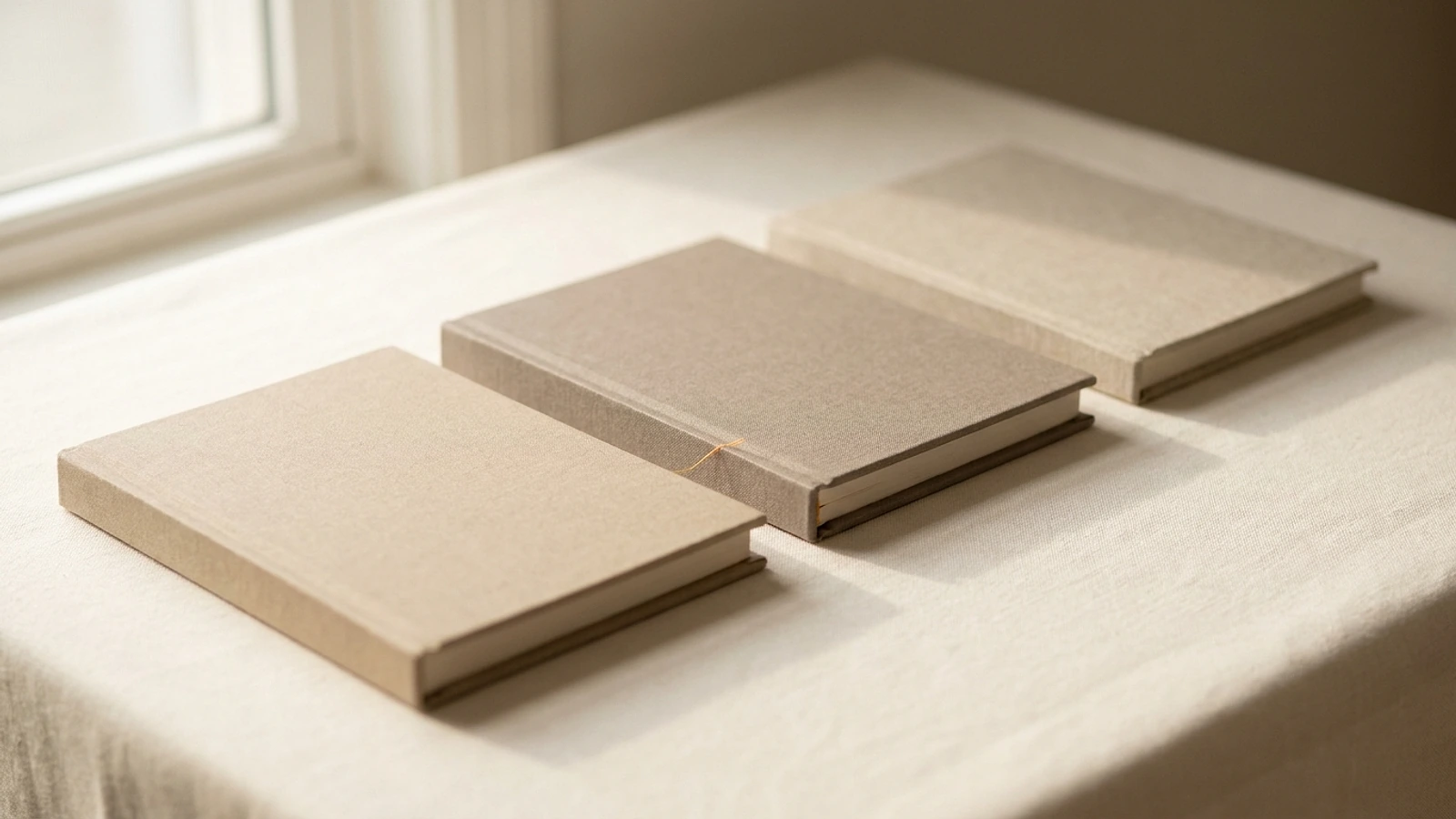
A single concept forces a yes or no on something you cannot un-see. Three concepts, genuinely different from each other rather than three colorways of one idea, let you react to directions instead of details. Authors are far better at recognizing what is right than at describing it in advance, and comparison is what makes that recognition possible.
You choose one and it gets refined to final files. The other two are not wasted; they usually clarify what you actually wanted, which is most of the value.
If you are planning a series
Series covers have one additional job: they must be recognizable as a set from across a screen. That usually comes from holding two or three elements constant and letting everything else change.
The reliable approach is to fix the typeface, the position of the title block, and the treatment of the author name, then vary the imagery and the dominant color per book. A reader who liked book one should recognize book four without reading the title. It is worth telling a designer up front that a series is planned, because the first cover then becomes a template rather than a one-off.
What it costs and how long it takes
Cover design is $690, flat. Not per concept and not per revision. That covers three distinct concepts, refinement of the one you choose, and both the print-ready spread and the ebook file.
Turnaround is 3 business days from payment and receipt of your brief. The price is on the pricing page before you speak to anyone, and you pay by card. Barker Publishing House has been designing covers for authors since 2018, and you keep 100 percent of your rights to the finished artwork.
One sequencing note. Your spine width depends on your final page count, which is set during book formatting. If the interior is not finished, the cover can be designed but not finalized, so it is worth knowing which order you are working in before you start. You can see how we work if you want the fuller picture.
Book cover questions, answered.
Ready for a cover that survives the thumbnail test?
See your exact price in the calculator, or talk to a real publisher first.
More on getting your book taken seriously.
How many cover concepts should you get?
Why one is too few and ten is worse, what makes concepts genuinely different, and how to choose without ruining the cover.

What print-ready actually means
Bleed, embedded fonts, CMYK, flattened layers, and rich black. What separates an accepted file from one that only looks fine.

Book cover dimensions for KDP and IngramSpark
Trim sizes, the spine width formula, bleed, safe margins, and the ebook ratio. Every number your cover file needs.